Adobe shares trendy Pantone flowers this summer
Adobe has teamed up with the Pantone Color Institute to showcase the color trends this summer. By compiling its findings in the Pantone Color Me Social Gallery, Adobe offers bold, intense tones at the moment. And although this does not change the theory of color, color trends affect designers and brands.
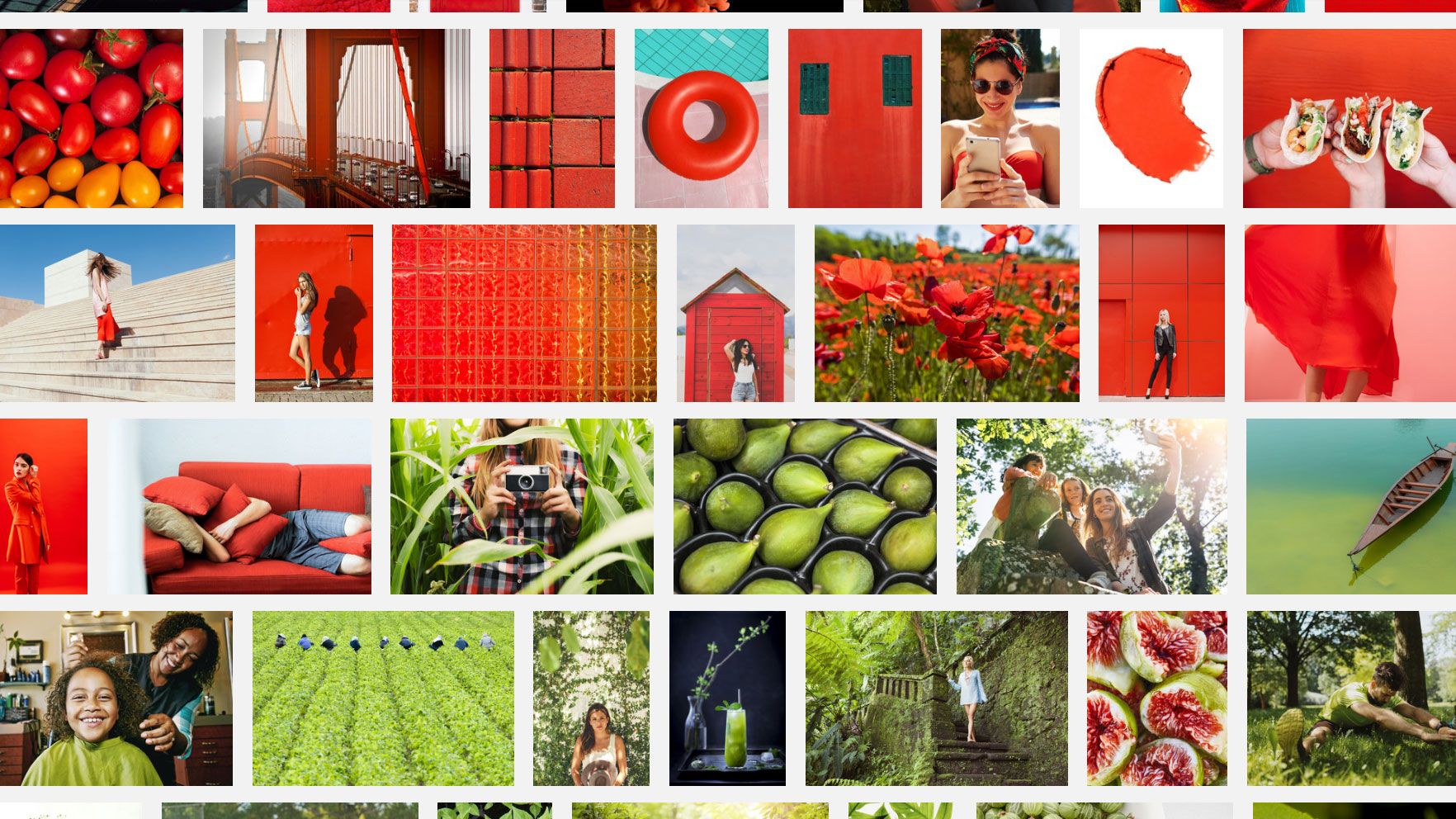
The colors mentioned are: Lime Green, Hawaiian Ocean, Flame Orange, Fuchsia Purple, Cherry Tomato, Blazing Yellow and Dazzling Blue. According to Lori Pressman, vice president of the Institute, these tones signify a change in color in color trends.
“After many years of essential and outrageous aesthetics, the thirst for a bright, rich color occupies a major place, as people want to excite a new kind of joy and create playful places,” she explains.
One of the key factors underlying this change is social media. Pressman believes that these online platforms provide users with the freedom to experiment with colors and intense impressions, which in turn leads to people gravitating towards more saturated shades.
Considering that social media is a steadily noisy world, it makes sense that brighter, more bold images on the rise of use, when users try to stand out from the crowd. When color is considered as a form of self-expression in social networks, bright colors lead to more interaction.
You can explore these vivid colors below in the post.
Despite the fact that this trend is rooted in social networks, saturated colors have shifted to the worlds of retail and fashion. This is an interesting appeal to the traditional design, which, as a rule, has seen how the fashion industry shapes the color trends for everyone else.
“While all shades stand out on the street and on the podium,” says the pressman, “we see that these colors are manifested in other areas – from travel to food. Some of the newest sources of inspiration for flowers are home furnishings, lifestyle and beauty. ”
Brands, museums and exhibitions can take advantage of these trends to connect to the audience. Lori adds that even if saturated colors do not immediately fit into your brand or company, “even a small accent or bright shade in the background can make an interesting trick.”
And with the Institute, predicting the current trend of color, to continue the path until the summer of 2020, there is plenty of time to get on board with this stunning palette.